Reducing Cognitive Load on Website Homepages
In today's fast-paced digital world, a website's homepage must be easy to navigate and understand. Reducing cognitive load is crucial in ensuring that users can quickly absorb information and engage with content. Simplifying navigation, using clear language, and optimizing visual hierarchy are key strategies in achieving this goal. This article will explore effective techniques to enhance user comprehension and engagement on homepages.


In today's fast-paced digital world, a website's homepage must be easy to navigate and understand. Reducing cognitive load is crucial in ensuring that users can quickly absorb information and engage with content. Simplifying navigation, using clear language, and optimizing visual hierarchy are key strategies in achieving this goal. This article will explore effective techniques to enhance user comprehension and engagement on homepages.

TL;DR: Reducing cognitive load on website homepages involves simplifying navigation, using clear language, and optimizing visual hierarchy. These strategies improve user comprehension and engagement.
Reducing cognitive load on a website's homepage isn't just about aesthetics, it's about functionality and user experience. When a homepage is cluttered or confusing, it can overwhelm visitors, leading to higher bounce rates and lower conversions. By focusing on clarity and ease of use, businesses can create a more welcoming environment that encourages users to explore further and take desired actions.
Why is Reducing Cognitive Load Important for Website Homepages?
Cognitive load refers to the amount of mental effort being used in the working memory. When a website is too complex, it increases cognitive load, making it difficult for users to process information. This can lead to frustration, disengagement, and ultimately, abandonment of the site.
A homepage with reduced cognitive load allows users to focus on the content without being distracted by unnecessary elements. This streamlined experience leads to better comprehension and higher engagement, which are crucial for achieving business goals such as conversions and customer retention. In an era where every second counts, reducing cognitive load is not just beneficial, it's essential.
"Most computer users have learned that running too many programs at the same time can slow down or even crash the machine."
— Minimize Cognitive Load to Maximize Usability, Minimize Cognitive Load to Maximize Usability
How to Simplify Navigation on Homepages?

Simplifying navigation is a fundamental step in reducing cognitive load. An intuitive navigation system helps users find information quickly and efficiently. Here are some techniques:
- Limit menu options: Avoid overwhelming users with too many choices. Aim for 5-7 main navigation items. This aligns with the psychological principle known as Miller's Law, which suggests that the average person can only hold 7 (plus or minus 2) items in their working memory at any given time.
- Use clear labels: Ensure that menu items are labeled with simple and descriptive terms. Vague or ambiguous labels can confuse users, making it difficult for them to find what they're looking for. Consider user testing to determine the most intuitive labels.
- Implement a search bar: Allow users to find specific information quickly, especially on content-heavy sites. A well-placed search bar can be a lifesaver for users who know exactly what they are looking for and don't want to navigate through menus.
- Breadcrumb navigation: This is particularly useful for users to understand their current location within the site's hierarchy. It provides context and allows for easy backtracking, which can reduce frustration.
- Responsive design: Ensure navigation elements are easy to use on all devices. With the increasing use of mobile devices, it's crucial that navigation remains intuitive across different screen sizes.
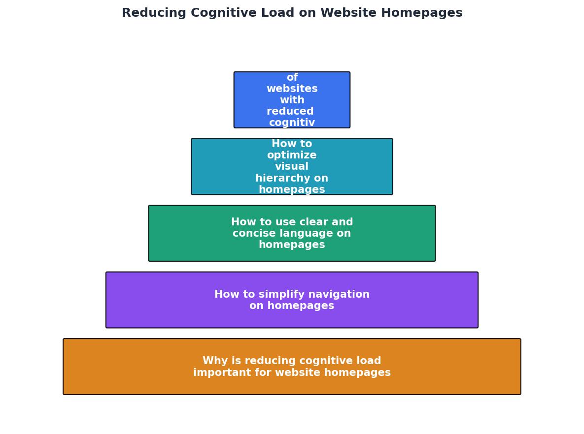
Process Diagram for Simplifying Navigation
How to Use Clear and Concise Language on Homepages?
Clear and concise language is key to accessibility and understanding. When users land on a homepage, they should immediately understand what the site offers and what actions they can take. Here’s how to improve text clarity:
- Use plain language: Avoid jargon and technical terms unless absolutely necessary. This is especially important if your audience includes users from diverse backgrounds or those who may not be familiar with industry-specific terms.
- Keep sentences short: Aim for sentences that are easy to read and understand. The recommended reading level for web content is around an eighth-grade level, which ensures that it is accessible to a broad audience.
- Highlight key information: Use formatting like bold or bullet points to draw attention to important details. This helps users scan the content quickly and find what they need without reading every word.
- Action-oriented language: Encourage users to take action with clear calls to action (CTAs). Instead of vague phrases like "Learn more," use specific actions like "Download our guide" or "Start your free trial."
- Consistent terminology: Use the same terms throughout your site to avoid confusion. If you refer to something as a "service" on one page, don't call it a "product" on another.
How to Optimize Visual Hierarchy on Homepages?

Visual hierarchy guides the user's eye to the most important elements on the page. Here are best practices for arranging visual elements effectively:
- Prioritize content: Place the most important information at the top of the page. This is often referred to as "above the fold" content, which should immediately capture the user's attention and convey the core message.
- Use size and color: Larger and more vibrant elements draw attention first. Use contrasting colors to highlight CTAs and ensure they stand out against the rest of the content.
- Maintain consistency: Use a consistent style for headings, buttons, and links to create a cohesive look. Consistency in design helps users predict where they can find certain information or actions, reducing the time and effort needed to navigate the site.
- Whitespace utilization: Don't be afraid of empty space. Whitespace can help separate different sections, making the content easier to digest and preventing the page from feeling cluttered.
- Visual cues: Utilize arrows, icons, or lines to guide users' eyes to important content or actions. These elements can subtly direct attention without overwhelming the user.
Examples of Websites with Reduced Cognitive Load
Successful websites that have reduced cognitive load often share common characteristics:
- Google: Known for its minimalist design, Google’s homepage is a prime example of simplicity, focusing solely on search functionality. Its clean interface ensures that users are not distracted by unnecessary elements and can focus solely on the task at hand.
- Apple: Apple’s website uses a clean layout with clear, bold typography and high-quality images to guide users through its product offerings. The use of ample whitespace and a consistent visual hierarchy makes it easy for users to navigate and find information.
- Medium: With its emphasis on reading and writing, Medium’s design is centered around simplicity. The site uses a straightforward navigation system and clean typography to encourage users to focus on content.
What are the Benefits of Reducing Cognitive Load on Homepages?
Reducing cognitive load on homepages offers numerous advantages:
- Increased engagement: Users are more likely to stay longer and explore more pages. A clear and intuitive design keeps users interested and encourages exploration.
- Higher conversion rates: Simplified pathways to conversion actions (like signing up or purchasing) lead to better results. When users can easily find and understand CTAs, they are more likely to take action.
- Improved accessibility: A clearer interface benefits all users, including those with cognitive disabilities. Ensuring that your site is accessible to everyone not only broadens your audience but also demonstrates a commitment to inclusivity.
- Reduced bounce rates: When users can quickly find what they're looking for, they are less likely to leave the site immediately. This can lead to lower bounce rates and a better overall user experience.
- Enhanced brand perception: A well-designed homepage that reduces cognitive load can improve users' perception of your brand, positioning you as professional and user-friendly.
FAQ
Frequently Asked Questions
Practical Guide: Reducing Cognitive Load on Website Homepages
To help you get started, here’s a step-by-step guide to reducing cognitive load on your homepage:
Steps to Reduce Cognitive Load
Your progress is saved automatically in your browser.
By focusing on these strategies, you can create a more user-friendly homepage that not only looks good but also functions efficiently, ultimately leading to better user engagement and higher conversion rates.
Additional Resources
- Minimize Cognitive Load to Maximize Usability - Minimizing Cognitive Load · Avoid visual clutter: redundant links, irrelevant images, and meaningless typography flourishes slow users down.
- Ease Cognitive Overload in UX Design - Use familiar UI patterns to reduce the learning curve and streamline interactions. To make things easier, consider using a website template to keep your design ...
- Web Design Principles that Reduce Cognitive Load - Design choices that reduce cognitive load: faster scanning, fewer errors, and clearer paths to completion across enterprise UX.
Need Help with Accessibility?
Improve your site's accessibility and conversion rates with our AI-powered analysis.
Get Started