Simplifying Complex Navigation Menus
Navigating a website should feel as intuitive as flipping through the pages of a favorite book. Yet, many sites have complex navigation menus that confuse rather than guide. Simplifying these menus can significantly enhance both accessibility and user experience. By organizing menu items logically, using clear labels, and ensuring responsive design, websites can become more inviting and user-friendly.

Navigating a website should feel as intuitive as flipping through the pages of a favorite book. Yet, many sites have complex navigation menus that confuse rather than guide. Simplifying these menus can significantly enhance both accessibility and user experience. By organizing menu items logically, using clear labels, and ensuring responsive design, websites can become more inviting and user-friendly.
TL;DR: Simplifying complex navigation menus involves organizing menu items, using clear labeling, and ensuring responsive design. These practices enhance accessibility and user experience.
In today's digital age, a website's navigation menu is its guiding star. It directs users to the information they seek, making it crucial for enhancing user experience. A well-designed menu can reduce bounce rates, improve accessibility, and boost conversions. Let's dive into how you can simplify complex navigation menus to improve your website's usability.
Why is Simplifying Navigation Menus Important for Websites?
A complex navigation menu can overwhelm users, leading to frustration and abandonment. Simplifying these menus is essential for accessibility and a seamless user experience. When users can easily find what they're looking for, they’re more likely to stay on your site longer and engage with your content.
One key aspect of a simplified navigation menu is reducing cognitive load. When users interact with a website, they should not be burdened with making too many choices or deciphering complicated pathways to find information. This reduction in cognitive load makes the site more accessible, especially to users with disabilities or those who are new to navigating digital interfaces.
Moreover, a streamlined navigation menu aligns with the principles of good user experience design, which emphasize clarity, efficiency, and user satisfaction. An intuitive menu can significantly enhance the perception of your brand, as visitors associate ease of use with professionalism and credibility.
How to Organize Menu Items Effectively?
Organizing menu items is akin to arranging the sections of a book. You want it to be logical and intuitive. Here are some techniques:
- Group related items: Categorize menu items into groups that make sense. For example, under "Shop," you might have "Men," "Women," and "Kids." Grouping items helps users quickly find related content without sifting through unrelated options.
- Limit the number of top-level items: Too many options can overwhelm users. Aim for 5-7 top-level items. This limitation not only prevents cognitive overload but also ensures that each menu item receives adequate attention, reducing the risk of important sections being overlooked.
- Use a hierarchical structure: Ensure that submenus are clearly related to their parent items, maintaining a logical flow. Hierarchical structures allow users to drill down into specific topics without losing context, thereby improving navigation efficiency.
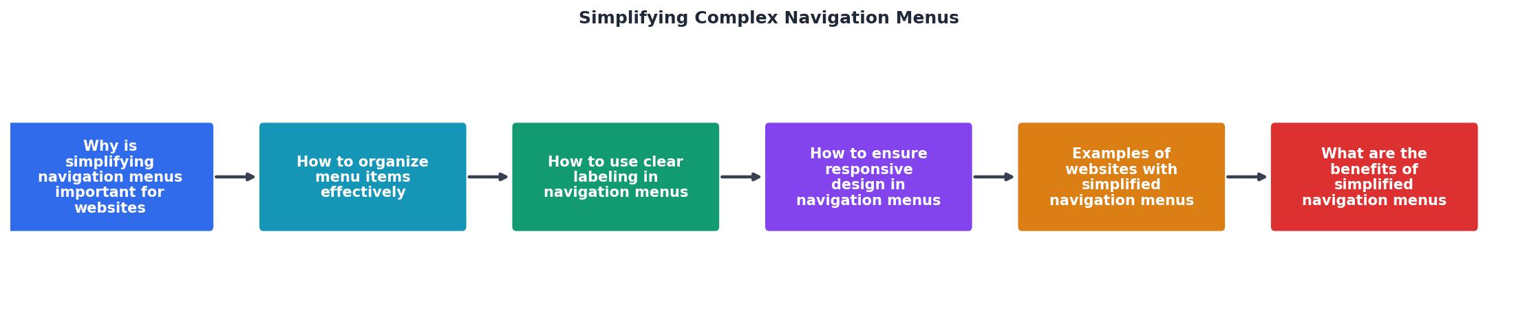
How to Use Clear Labeling in Navigation Menus?
Clear labeling is crucial for making navigation menus understandable and accessible. Here’s how you can achieve that:
- Use familiar terms: Stick to common terminology that users will recognize. Avoid using industry jargon or branded terms that might not be widely understood. Familiarity breeds comfort, and users are more likely to engage with menus that speak their language.
- Be concise: Keep labels short and to the point, avoiding jargon. Long or complex labels can confuse users and clutter your menu, detracting from its usability.
- Test with real users: Validate your labels by observing how users interact with them and making adjustments as needed. User testing can reveal misunderstandings or preferences that you might not have anticipated, allowing for more effective labeling.
In addition to these practices, consider the visual presentation of your labels. Use contrasting colors and readable fonts to enhance visibility, particularly for users with visual impairments. Also, ensure that labels are descriptive enough to convey the purpose of the link without additional context.
How to Ensure Responsive Design in Navigation Menus?
Responsive design ensures that your navigation menu works seamlessly across all devices, from desktops to smartphones. Here are some best practices:
- Adopt a mobile-first approach: Design your menu with mobile users in mind, then scale up for larger screens. This approach ensures that the most constrained environment is prioritized, resulting in a cleaner, more efficient design.
- Use collapsible menus: On smaller screens, use a hamburger icon to collapse the menu, conserving space. This technique keeps the interface uncluttered while still providing access to all menu items when needed.
- Ensure touch-friendly elements: Make sure menu items are easily clickable on touchscreens. This includes using sufficient padding around menu items and ensuring that links are large enough to be tapped comfortably.
"The busy “hubs” of user interactions typically require faster and easier access across the product."
— Simplifying Mobile Navigation Menus, Simplifying Mobile Navigation Menus
Examples of Websites with Simplified Navigation Menus
These sites often employ a minimalist design philosophy, using whitespace effectively to highlight menu items and relying on intuitive iconography to guide users. By studying such examples, you can gain insights into effective layout strategies and innovative solutions for common navigation challenges.
What are the Benefits of Simplified Navigation Menus?
Simplified navigation menus offer numerous benefits:
- Enhanced user engagement: Users can find what they need quickly, which keeps them on your site longer. This increased engagement can lead to higher page views, longer session durations, and more return visits.
- Improved accessibility: Clear, organized menus are easier to navigate for users with disabilities. By adhering to accessibility standards, you can ensure that your website is usable by the widest possible audience, including those who rely on screen readers or keyboard navigation.
- Increased conversions: When users have a positive experience, they are more likely to convert. Whether your goal is to sell products, gather leads, or disseminate information, a simplified navigation menu can help achieve these objectives by reducing friction in the user journey.
FAQ
Frequently Asked Questions
Practical Checklist for Simplifying Complex Navigation Menus
To ensure your website’s navigation menu is optimized for both usability and accessibility, use this checklist:
Checklist for Simplifying Complex Navigation Menus
Your progress is saved automatically in your browser.
Incorporating these strategies can transform your website's navigation from a maze into a clear path, improving user satisfaction and engagement. What techniques have you found effective in simplifying navigation menus? Share your insights in the comments below.
Key Metrics
This interactive card highlights the impact of simplified navigation menus on user engagement and conversion rates. By focusing on these key metrics, you can better understand the tangible benefits of optimizing your website's navigation.
Additional Resources
- Simplifying Mobile Navigation Menus - Simplifying mobile navigation menus means redesigning how people find and access features on their phones, making it as easy and clear as possible.
- Efficiently Simplifying Navigation, Part 1: Information ... - A four-step guide to efficiently simplifying the navigation experience, by analyzing the type and amount of content as well as choosing and carefully designing ...
- Simplifying Complex Navigation Menus - The 508 Advantage - Streamline Menu Items: Limit the number of options in menus to reduce complexity and make choices more straightforward. Logical Grouping: Organize related items ...
Need Help with Accessibility?
Improve your site's accessibility and conversion rates with our AI-powered analysis.
Get Started