
Most websites are built by people who understand them instantly. They know the jargon, the navigation logic, the unstated assumptions. But roughly 42% of your visitors may struggle to follow the same path. Some have ADHD and get lost in walls of text. Others have dyslexia and stumble on dense paragraphs. Still others are simply overwhelmed by too many choices, confusing layouts, or unclear language. Cognitive accessibility removes these invisible barriers, making your site work for everyone.
Photo by Yan Krukau from Pexels
TL;DR:- Cognitive accessibility makes digital experiences understandable for users with cognitive disabilities and cognitive load challenges, including people with ADHD, dyslexia, anxiety, and low digital literacy.
- Benefits include higher engagement, better conversion rates, reduced bounce rates, and genuinely inclusive design that improves experience for all users.
- Key features: clear language, intuitive navigation, logical information hierarchy, reduced distractions, and consistent patterns.
What Is Cognitive Accessibility?
Cognitive accessibility refers to design practices that remove barriers to understanding, navigation, and interaction for people with cognitive disabilities or cognitive load challenges. It's not about lowering standards or dumbing down content. It's about clarity, structure, and respect for human attention.
Cognitive disabilities include ADHD, dyslexia, dyscalculia, autism spectrum, anxiety disorders, intellectual disabilities, and acquired brain injuries. But cognitive accessibility also helps people without diagnosed disabilities: first-time visitors, non-native speakers, people on mobile phones, and anyone under cognitive load (tired, rushed, distracted). In short, good cognitive accessibility makes your site work better for everyone.
"The accessibility issues addressed in this guidance are essential for people with certain disabilities to be able to use digital technology.">, Cognitive Accessibility at W3C
Why Cognitive Accessibility Matters in Business
The business case is straightforward: clarity and simplicity convert. When visitors understand your product, they buy it. When they get lost, they leave.
Cognitive accessibility directly impacts:
- Conversion rate: Users who understand your offer move to checkout. Users who are confused bounce.
- Engagement time: Clear navigation and scannable content keep visitors on your site longer.
- Support burden: Fewer confused emails and calls if your site explains itself clearly.
- Brand trust: A site that respects your attention and communicates plainly feels more trustworthy.
- SEO: Search engines favor content that is well-structured, plain-language, and easy to scan.
- Legal risk: Cognitive accessibility is increasingly part of accessibility compliance (WCAG, ADA, European Accessibility Act).
For founders and product leaders, cognitive accessibility is a growth lever. You already pay for traffic. Better comprehension means more conversions from that same traffic.
Common Barriers Users Face Online

Real visitors encounter these barriers every day:
- Dense text blocks: Paragraphs that go on for 10+ lines overwhelm readers, especially those with ADHD or dyslexia. Eyes skip around, focus breaks.
- Unclear jargon: Terms like "SaaS," "API," "conversion funnel," or industry-specific language alienate anyone outside your bubble.
- Poor hierarchy: No clear distinction between headings, subheadings, and body text. Visitors can't scan or find what they need.
- Too many choices: Seven pricing tiers, fifteen navigation links, a dozen call-to-action buttons. Choice paralysis kicks in.
- Inconsistent patterns: Buttons that sometimes say "Continue," sometimes "Next," sometimes "Go." Users have to re-learn the interface constantly.
- Distracting animations: Auto-playing videos, infinite scroll, pop-ups that steal focus. Attention gets hijacked.
- Lack of context: Forms that don't explain why you're asking for information. Navigation that doesn't show where the user is in a flow.
- No undo or confirmation: Users make mistakes and lose their work, or worse, accidentally submit wrong data.
Examples of Cognitive Accessibility Features
The good news: fixing these barriers is concrete and actionable. Here are proven features and patterns:
Clear language and structure:- Use short sentences (fewer than 20 words).
- Break text into smaller paragraphs (3-4 sentences each).
- Use a logical heading hierarchy (H1, then H2, then H3, no skipping levels).
- Avoid jargon; define technical terms on first use or link to a glossary.
- Use bullet lists to break up information.
- Clear, consistent menu labels that describe what visitors will find.
- Breadcrumb trails showing where the user is ("Home > Products > Pricing").
- Search functionality that works well and suggests relevant results.
- One clear call-to-action per page; secondary CTAs are de-emphasized.
- Ample whitespace so the page doesn't feel crowded.
- Sufficient color contrast (WCAG AA minimum: 4.5:1 for text).
- Consistent use of colors and icons (e.g., all errors shown in red, all success in green).
- Predictable button placement and styling.
- Minimize form fields; ask only what you need, when you need it.
- Provide help text and examples inline with forms.
- Pre-fill data when possible (e.g., auto-detect location, remember email).
- Show progress in multi-step processes ("Step 2 of 5").
- Same navigation on every page.
- Consistent button labels and placements.
- Familiar patterns (e.g., logout always in the top right; search always a magnifying glass icon).
- Clear error messages that explain what went wrong and how to fix it (not just "Error 400").
- Confirmation dialogs before destructive actions ("Are you sure?").
- Undo functionality where possible.
- Autosave so users don't lose work if they navigate away.

How These Features Impact User Experience and Engagement
When you implement cognitive accessibility features, the results are measurable:
Engagement improves:
Users spend more time on your site because they understand it and don't get frustrated. Navigation feels natural, so they explore further.
Comprehension increases:
Clear language and hierarchy mean visitors actually absorb your message. They understand your value proposition without having to re-read or guess.
Conversion rises:
Fewer barriers means fewer drop-offs. A visitor who understands your offer and trusts your interface is more likely to complete a purchase or sign-up.
Support costs drop:
Fewer confused visitors means fewer support requests. Your FAQ and help docs can be shorter because the site explains itself.
Loyalty builds:
Users who have a smooth, clear experience come back. They recommend the site to others. They're willing to pay more because the experience feels respectful and professional.
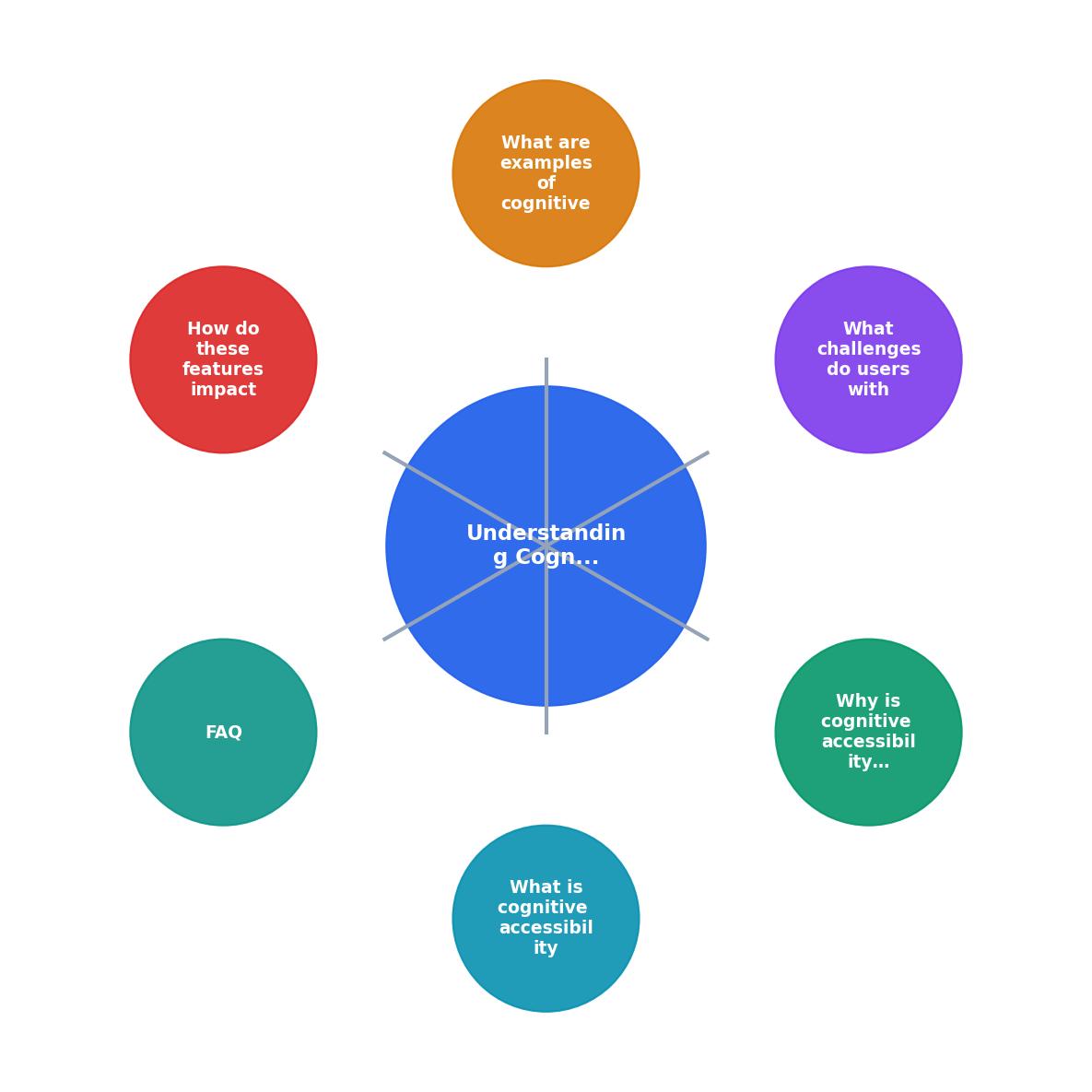
The process is iterative. Start by identifying barriers (research, testing, analytics), then apply accessibility features, measure engagement, and repeat. Each cycle compounds clarity and trust.
A Framework for Evaluating Your Site
To audit your digital product for cognitive accessibility, use this checklist as a starting point:
Cognitive Accessibility Evaluation Checklist
Your progress is saved automatically in your browser.
Interactive Cognitive Accessibility Impact Dashboard
To visualize how cognitive accessibility improvements translate to engagement metrics, consider this example dashboard of before-and-after data:
Typical Engagement Gains (Post-Implementation)
This dashboard shows realistic improvements observed across SaaS and e-commerce sites after implementing cognitive accessibility features. The gains compound: higher engagement means more opportunities for conversion, lower support load frees up resources, and reduced friction builds brand loyalty.
FAQ
Frequently Asked Questions
What barriers do you suspect your visitors face when they first land on your site? The answer lies in understanding their struggle, not your intent.
Additional Resources
- Cognitive Accessibility at W3C - Cognitive and learning disabilities impact how people process information. For example, they can affect people's perception, memory, language, attention, ...
- The Complete Guide to Cognitive Accessibility for ... - Cognitive accessibility refers to creating a digital environment, such as a website, that is accessible to those with cognitive and learning ...
- How Cognitive Accessibility Helps Create Better User Paths - Cognitive accessibility is about making digital content clear, simple, and easy to navigate so people with cognitive disabilities can use it and ...
Need Help with Accessibility?
Improve your site's accessibility and conversion rates with our AI-powered analysis.
Get Started