User-Centered Design Practices for Enhanced Comprehension
Most digital products are designed by people who already understand them. That creates a blind spot where teams ship interfaces that make perfect sense internally but confuse the actual humans clicking through them. User-centered design closes that gap by putting real user comprehension at the center of every design decision. This guide walks through the specific practices, research methods, and feedback mechanisms that turn confusing experiences into clear ones.

Most digital products are designed by people who already understand them. That creates a blind spot where teams ship interfaces that make perfect sense internally but confuse the actual humans clicking through them. User-centered design closes that gap by putting real user comprehension at the center of every design decision. This guide walks through the specific practices, research methods, and feedback mechanisms that turn confusing experiences into clear ones.

- User-centered design (UCD) improves comprehension by grounding every interface decision in observed user behavior, not assumptions.
- Core practices include structured user research, iterative prototype testing, and continuous feedback loops.
- Teams that adopt UCD consistently see higher task completion rates, lower support tickets, and better conversion.
What is user-centered design?
User-centered design is a framework where the needs, limitations, and behaviors of end users drive every stage of the design process. It originated from Don Norman's work at UCSD in the 1980s and became formalized in ISO 9241-210 as "human-centred design for interactive systems."
The key distinction: UCD is not about asking users what they want. It is about observing what they do, identifying where comprehension breaks down, and redesigning until the interface communicates clearly without requiring extra effort.
For UX and product designers, UCD provides something critical: evidence. Instead of defending a layout change with "I think this is clearer," you can point to task completion data from a usability test. That shifts the conversation from opinion to observation.
"Being human-centred is an additional cost to any project, so businesses rightly ask whether taking so much time to talk to people, produce prototype designs and so on is worthwhile.">, What is User Centered Design (UCD)?, updated 2026
The answer, consistently, is yes. The cost of fixing comprehension problems after launch (support tickets, lost conversions, redesigns) dwarfs the cost of catching them early through UCD methods.
How user research improves design
User research is the foundation. Without it, you are designing for yourself. Here are the methods that directly improve comprehension:
- Contextual interviews - Watch users interact with your product in their actual environment. A 30-minute session at someone's desk reveals more about comprehension barriers than a week of internal brainstorming.
- Task-based usability tests - Give participants a specific goal ("Find the pricing for the team plan") and observe where they hesitate, misclick, or give up. Record time-on-task and error rates.
- Card sorting - Ask users to organize your content categories. This exposes mismatches between your information architecture and how users actually think about the content.
- Surveys with comprehension checks - After reading a page, ask users to explain what it means in their own words. If their summary does not match your intent, the page has a comprehension problem.
- First-click testing - Show a screenshot and ask "Where would you click to do X?" If fewer than 60% of participants click the right area, the layout is not communicating clearly.
The common objection is time. A full research study takes weeks. But a guerrilla usability test with five participants takes an afternoon and catches roughly 85% of major usability issues, according to Nielsen Norman Group's research. Five users. One afternoon. That is the minimum viable research effort.
Iterative testing drives clarity
Designing for comprehension is not a one-pass activity. The first version of any interface will have blind spots. Iterative testing means building, testing, learning, and rebuilding in short cycles.
Here is what an effective iteration loop looks like:
- Build a low-fidelity prototype - Paper sketches or Figma wireframes. No polish needed.
- Test with 3-5 users - Focus on task completion and comprehension, not aesthetics.
- Identify the top 3 comprehension failures - Where did users misunderstand, hesitate, or fail?
- Redesign those specific elements - Change one variable at a time so you know what worked.
- Test again - Repeat until task completion exceeds your threshold (typically 80%+).
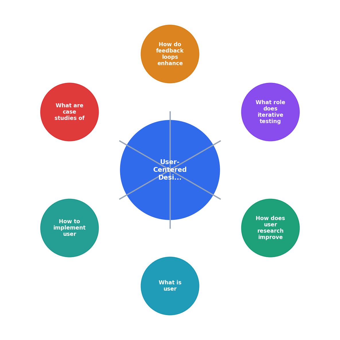
The diagram above shows the cycle: Research, Prototype, Test, Refine, and back to Research. Each pass through the loop tightens comprehension. Spotify's design team famously runs this loop weekly on new features, testing with internal users on Mondays and external users on Thursdays. The result is interfaces that feel obvious on first use.
| Waterfall Design | Iterative UCD |
|---|---|
| Test once at the end | Test every sprint |
| Fix comprehension issues post-launch | Catch issues in prototyping |
| Expensive rework | Low-cost adjustments |
| Assumptions drive decisions | Evidence drives decisions |
| Verify users understand |
Feedback loops that work

A feedback loop connects user behavior back to design decisions in a structured, repeatable way. Three types matter most for comprehension:
In-product feedback signals. Track where users trigger help tooltips, reread content, or abandon multi-step flows. Tools like Hotjar, FullStory, or PagePerson Insights surface these patterns without requiring users to fill out a form. When you see 40% of users hovering over the same label, that label is not clear enough.
Post-task surveys. After a user completes (or abandons) a key flow, ask two questions: "How easy was this?" (1-5 scale) and "What was confusing?" (open text). Keep it short. Completion rates on two-question surveys run above 30%; anything longer drops below 10%.
Support ticket analysis. Your support team already collects comprehension failure data. Categorize tickets by "user did not understand X" and feed that back to the design team monthly. If "How do I cancel my subscription?" appears 50 times a month, the cancellation flow has a comprehension problem.
The critical part: feedback must flow back to designers within the same sprint. If insights sit in a report for three months, they are useless. Build a weekly ritual where the design team reviews the top five comprehension signals from the previous week.
Real-world UCD success stories

GOV.UK rebuilt the entire UK government web presence using UCD principles. Every page went through multiple rounds of usability testing with citizens of varying digital literacy levels. The result: task completion rates jumped from around 40% on legacy government sites to over 80% on GOV.UK. They published their design system openly, and it became a reference for public-sector UX worldwide.
Mailchimp redesigned their campaign builder after observing that new users could not distinguish between "campaigns" and "automations." Card sorting sessions revealed that users grouped these features differently than the product team expected. The redesigned navigation reduced onboarding support tickets by 30%.
Duolingo runs A/B tests on lesson comprehension continuously. When users fail a lesson type at rates above a threshold, the design team restructures the lesson flow. This iterative approach keeps daily active user retention above 60%, which is exceptional for a learning app.
The following dashboard illustrates typical comprehension metrics a UCD team tracks across iterations:
UCD Comprehension Tracker (Example)
Implement UCD in your project
Getting started does not require a dedicated research lab. Here is a practical sequence that works for teams of any size:
- Define comprehension goals - Pick the three flows where user understanding matters most (onboarding, checkout, key feature adoption).
- Recruit five test participants - Use your existing user base, social media, or services like UserTesting.com. Match your actual audience demographics.
- Run task-based sessions - Give each participant a goal. Observe silently. Note every hesitation, misclick, and verbal confusion.
- Synthesize findings - Group issues by severity. A comprehension failure that blocks task completion ranks higher than a minor label confusion.
- Prototype fixes - Build low-fidelity solutions for the top three issues. Do not over-invest in polish at this stage.
- Test the fixes - Run the same tasks with new participants. Compare task completion rates.
- Ship and monitor - Deploy the improved design. Set up feedback loops (analytics, surveys, support ticket tagging) to catch regressions.
Tools like PagePerson Insights can accelerate step 4 by automatically identifying cognitive accessibility barriers on live pages, giving you a prioritized list of comprehension issues without running a full usability study.
User-Centered Design Implementation Checklist
Your progress is saved automatically in your browser.
FAQ
Frequently Asked Questions
Additional Resources
- What is User Centered Design (UCD)? — updated 2026 - User-centered design focuses on users and their needs in each design phase, enhancing usability and accessibility for better products.
- User-Centered Design: Principles and Examples of UCD - User-Centered Design places users' needs, goals, and feedback at the center of the design process. Learn how UCD can improve your e-commerce site.
- User-Centered Design and Interactive Health Technologies ... - User-centered design (UCD) is an approach that involves end-users throughout the development process so that technology support tasks, are easy to operate,
Need Help with Accessibility?
Improve your site's accessibility and conversion rates with our AI-powered analysis.
Get Started