How UX Design Enhances Cognitive Accessibility for Anxiety-Prone Users
A user lands on your checkout page, sees a countdown timer, three upsell modals, and a form that resets on every validation error. Their heart rate spikes, they close the tab, and your conversion drops by one. Anxiety-prone users are not an edge case. They represent a significant share of your audience, and the design choices you make either calm them down or push them away.

A user lands on your checkout page, sees a countdown timer, three upsell modals, and a form that resets on every validation error. Their heart rate spikes, they close the tab, and your conversion drops by one. Anxiety-prone users are not an edge case. They represent a significant share of your audience, and the design choices you make either calm them down or push them away. This guide walks through concrete UX patterns that reduce cognitive friction for anxious visitors and make your product more usable for everyone.

- Anxiety-prone users abandon interfaces that feel unpredictable, overloaded, or pressuring.
- Reducing cognitive load through progressive disclosure, consistent navigation, and calm visual design directly improves both accessibility and conversion.
- Specific patterns like inline validation, visible progress indicators, and generous timeouts make the difference between a completed task and a closed tab.
Why anxiety shapes UX outcomes
Roughly 1 in 5 adults experiences an anxiety disorder in any given year. That statistic alone should change how you approach interface design. But even users without a clinical diagnosis encounter situational anxiety: filling out a medical form, entering payment details, or navigating government services under a deadline.
When anxiety activates, working memory shrinks. Users lose the ability to hold multiple pieces of information simultaneously. They scan for threats instead of reading content. They interpret ambiguity as danger. Every unclear label, unexpected layout shift, or missing confirmation becomes a reason to bail.
This is not about making things "nice." It is about removing barriers that prevent task completion. A form that preserves input on error, a navigation bar that stays put, a button that says exactly what it does: these are accessibility features with direct conversion impact.

Minimize cognitive load
Cognitive load is the total mental effort required to use an interface. For anxiety-prone users, every unnecessary element adds weight. Here is how to strip it down.
Show less, reveal on demand
Progressive disclosure means showing only what the user needs at each step. Stripe's checkout flow does this well: one field at a time, with the next appearing only after the current one is complete. Compare that to a single-page form with 15 fields visible at once.
- Break long forms into multi-step wizards with a visible progress bar.
- Hide advanced options behind expandable sections labeled clearly (e.g., "More options" not "Advanced").
- Limit choices per screen. The Hick-Hyman law is real: more options means slower, more stressful decisions.
Reduce visual noise
Every animation, badge, banner, and floating widget competes for attention. Anxious users process all of it, not just the content you intended.
- Remove auto-playing carousels. They create urgency and unpredictability.
- Use whitespace generously. GOV.UK's design system treats whitespace as a functional element, not decoration.
- Limit color palette to 2-3 primary colors. High-contrast, saturated interfaces feel aggressive.
Calming design patterns

Design patterns that reduce anxiety share a common trait: they give users a sense of control and predictability.
Inline validation over error pages
Nothing triggers anxiety faster than submitting a form and getting a wall of red error messages at the top. Inline validation checks each field as the user completes it, providing immediate, specific feedback.
- Show green checkmarks for valid fields. Positive reinforcement matters.
- Write error messages that explain what to do, not just what went wrong. "Enter a 10-digit phone number" beats "Invalid input."
- Never clear the entire form on error. Losing entered data is one of the top anxiety triggers in web forms.
Generous timeouts and no fake urgency
Countdown timers ("Only 2 left!" or "Session expires in 3:00") are conversion dark patterns that exploit anxiety. They work on some users and completely shut down others.
- If sessions must expire, warn users 2 minutes before and offer a one-click extension.
- Remove artificial scarcity indicators unless they reflect real inventory.
- Let users save progress and return later. Typeform and Google Forms both allow this.
Confirm before destructive actions
Deleting an account, canceling a subscription, submitting a final application: these actions carry emotional weight. A simple confirmation dialog with clear language ("This will permanently delete your account and all data. Continue?") gives anxious users the safety net they need.
The following diagram summarizes the core UX strategies at a glance:
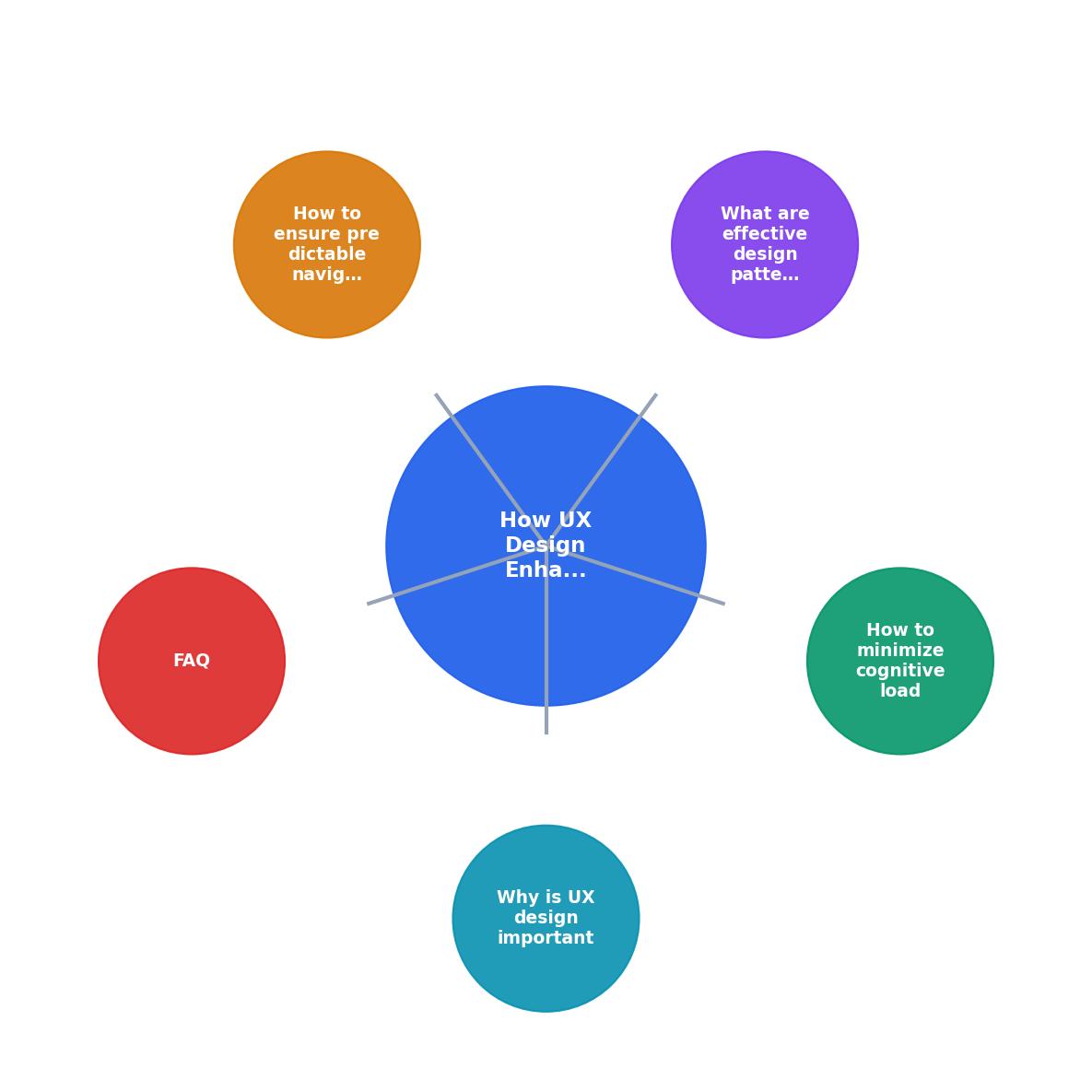
The steps are: Audit cognitive load, Apply progressive disclosure, Standardize navigation, Add inline validation, Test with real users. Each feeds into the next, creating a cycle of continuous improvement.
Ensure predictable navigation

Predictable navigation means the user always knows where they are, where they can go, and how to get back. Anxiety spikes when users feel lost.
Keep navigation consistent
- Place the main navigation in the same position on every page. Top horizontal or left sidebar, pick one and stick with it.
- Use the same labels across the site. If the menu says "Pricing" do not label the page heading "Plans & Packages."
- Breadcrumbs are underrated. They give anxious users an escape route and spatial context simultaneously.
Make the current state visible
- Highlight the active page in the navigation menu.
- Show clear page titles that match the link the user clicked.
- Use progress indicators in multi-step flows. A "Step 2 of 4" label reduces uncertainty dramatically.
"1.4.4 Resize Text: Support users increasing text size up to 200% without content loss or functionality problems.">, Give Users' Brains a Break: UX Tips for Cognitive Accessibility
Text resizing is a concrete example of predictable behavior. When a user increases font size and the layout breaks, that is an anxiety trigger. Responsive typography that reflows cleanly tells the user: this interface adapts to you, not the other way around.
Avoid surprise layout shifts
Cumulative Layout Shift (CLS) is not just a Core Web Vitals metric. It is an anxiety metric. When a button moves right as the user reaches for it, trust breaks. Reserve space for images and ads before they load. Use min-height on containers. Test on slow connections.
Here is an example dashboard showing how anxiety-related UX metrics might look for a typical e-commerce checkout flow:
Checkout Anxiety Audit, Example Metrics
Tools like PagePerson Insights can help you identify specific cognitive friction points on your pages, including areas where anxious users are most likely to abandon a flow, so you can prioritize fixes with real evidence instead of guesswork.
Anxiety-Friendly UX Design Checklist
Your progress is saved automatically in your browser.
FAQ
Frequently Asked Questions
Additional Resources
- Give Users' Brains a Break: UX Tips for Cognitive ... - Thoughtful UX reduces user error by anticipating mistakes and guiding users toward avoiding or fixing them. Remember to use clear instructions, ...
- Cognitive Accessibility: A New Frontier in UX Design - Cognitive Accessibility is becoming one of the most important aspects of modern UX and most teams still don't realise it.
- Essential UX Principles for Cognitive Accessibility - Designing for cognitive accessibility means creating user interfaces that accommodate different thinking styles, processing speeds, memory capacities, and ...
Need Help with Accessibility?
Improve your site's accessibility and conversion rates with our AI-powered analysis.
Get Started