Best Practices for Creating Readable and Accessible Content
Your website copy looks great to you and your team. It tested well in internal reviews. But 42% of visitors still bounce before they finish reading the first paragraph. The gap between what content creators think is clear and what real visitors actually comprehend costs businesses conversions every single day.

Your website copy looks great to you and your team. It tested well in internal reviews. But 42% of visitors still bounce before they finish reading the first paragraph. The gap between what content creators think is clear and what real visitors actually comprehend costs businesses conversions every single day. This guide covers the specific practices that close that gap and turn confusing pages into content that works for everyone.

- Use plain language at a 6th-to-8th grade reading level to reach the widest audience.
- Structure text with short paragraphs, descriptive headings, and generous white space.
- Maintain a minimum 4.5:1 color contrast ratio for body text (WCAG AA).
- Test readability scores and run accessibility audits before every publish.
The real cost of poor readability
Content that visitors cannot quickly parse does not just frustrate them. It directly reduces conversion rates. When someone lands on a pricing page or product description and hits a wall of jargon, dense paragraphs, or low-contrast text, they leave. They do not ask for clarification. They click back.
That number is not hypothetical. Cognitive barriers like reading difficulty, attention fatigue, and visual strain affect a massive portion of any audience. People with dyslexia, ADHD, low vision, or simply those reading on a phone in bright sunlight all need content designed with care.
The business case is straightforward: readable, accessible content converts better because more people can actually use it.
Clear language drives comprehension

Plain language means choosing words your audience already knows. It does not mean dumbing things down. It means respecting the reader's time.
Here is what works:
- Replace jargon with common words. "Utilize" becomes "use." "Facilitate" becomes "help." "Leverage" becomes... just say what you mean.
- Keep sentences under 20 words on average. Longer sentences force readers to hold more information in working memory. That is where you lose people with cognitive load issues.
- Use active voice. "We process your order in 24 hours" beats "Your order will be processed within a 24-hour timeframe."
- Define technical terms on first use. If you must use a specialized word, bold it and explain it immediately.
- Front-load key information. Put the answer first, then the explanation. Visitors scan; give them what they need at the top of each section.
The using plain language to improve website comprehension guide goes deeper into specific rewriting techniques.
Studies on government websites consistently show that rewriting content in plain language improves task completion rates by 50-70%. The same principle applies to landing pages, product descriptions, and checkout flows.
Text layout that reduces cognitive load
Layout is not decoration. It is a comprehension tool. Two identical paragraphs with different formatting produce completely different reading experiences.
White space gives the brain breathing room between ideas. Cramped text triggers scanning fatigue, especially on mobile screens where a single paragraph can fill the entire viewport.
Key layout practices:
- Line length: Keep body text between 50-75 characters per line. Wider lines force excessive eye movement. Narrower lines break reading rhythm.
- Line height: Set
line-heightto at least 1.5x the font size. Tight leading makes lines blur together for readers with dyslexia. - Paragraph length: Cap paragraphs at 3-4 sentences. Each paragraph should make one point.
- Headings as signposts: Every H2 and H3 should tell the reader what they will learn in that section. "Features" is vague. "Three features that reduce checkout friction" is useful.
- Bullet and numbered lists: Break sequential steps or grouped items out of paragraph form. Lists are faster to scan and easier to reference.
Color contrast and visual accessibility

Color contrast ratio measures the luminance difference between foreground text and its background. WCAG 2.1 Level AA requires a minimum of 4.5:1 for normal text and 3:1 for large text (18px bold or 24px regular).
This is not optional styling. Low contrast makes content literally invisible to people with low vision, color blindness, or anyone reading on a washed-out laptop screen in a coffee shop.
Common mistakes:
- Light gray text on white backgrounds (the "elegant" design trap)
- Colored text on colored backgrounds without checking the ratio
- Placeholder text in form fields with insufficient contrast
- Links that are only distinguished by color, with no underline or other visual cue
| Low Contrast (Fails AA) | High Contrast (Passes AA) |
|---|---|
| #999 on #fff (2.8:1) | #595959 on #fff (7:1) |
| Hard to read in sunlight | Readable in all conditions |
| Excludes low-vision users | Inclusive by default |
| Looks "modern" but hurts | Looks clean and works |
"Here are some important Do's and Don'ts to help you think about creating accessible content.">, Best practices for writing for the accessible web
Real examples that get it right

Gov.uk rewrote their entire web presence using plain language principles. Average reading level dropped to roughly age 9 comprehension. Task completion rates went up. Support requests went down.
Stripe's documentation uses a clean two-column layout with code on the right and explanation on the left. Headings are descriptive. Paragraphs rarely exceed three sentences. Color contrast exceeds AA standards throughout.
Apple's support pages break complex troubleshooting into numbered steps with one action per step. Each step starts with a verb. Screenshots accompany text where the interface is not obvious.
What these examples share: short sentences, clear hierarchy, high contrast, and a relentless focus on the reader's task rather than the writer's vocabulary.
The writing web content for people with cognitive disabilities resource covers additional patterns for inclusive content design.
How to run readability and accessibility audits
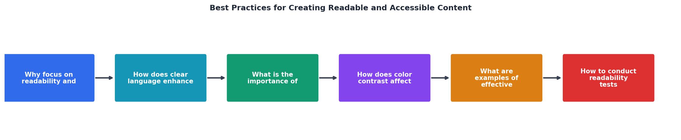
A readability and accessibility audit does not require expensive consultants. Here is a practical process you can run before every content publish:
- Check reading level. Paste your text into Hemingway Editor or use the Flesch-Kincaid tool in Microsoft Word. Aim for grade 6-8.
- Scan heading structure. Verify headings follow a logical H1 > H2 > H3 hierarchy with no skipped levels. Each heading should make sense out of context.
- Test color contrast. Run every text/background combination through WebAIM's Contrast Checker. Fix anything below 4.5:1.
- Validate with a screen reader. Open the page with NVDA (Windows) or VoiceOver (Mac) and listen. Does the content make sense when read linearly?
- Run automated checks. Use axe DevTools or WAVE to catch structural issues like missing alt text, empty links, or improper ARIA labels.
- Review on mobile. Load the page on an actual phone. Check that text is readable without zooming and that tap targets are large enough.
- Get a fresh pair of eyes. Ask someone unfamiliar with the content to read it and summarize the main point. If they cannot, rewrite.
The following interactive card summarizes the key readability benchmarks to keep visible during your audit process:
Readability Audit Benchmarks
Content Readability & Accessibility Audit Checklist
Your progress is saved automatically in your browser.
FAQ
Frequently Asked Questions
Additional Resources
- Best Practices by Topic - Digital Accessibility - Best practices in digital accessibility can be broken down into several key topics, including alternative text, color usage, captioning, and more.
- Best practices for writing for the accessible web | Digital.gov - Offer descriptive links with context of what is being shared. · Use visual cues, such as changing the link's colors and underlining.
- 10 Tips for Creating Accessible Content - Choose Accessible Fonts & Sizes. 2. Pick High-Contrast Color Combinations. 3. Position Text Appropriately. 4. Use Plain, Inclusive Language.
Need Help with Accessibility?
Improve your site's accessibility and conversion rates with our AI-powered analysis.
Get Started