Tracking Metrics for Cognitive Load Improvements
You redesigned your landing page, simplified the copy, and removed three unnecessary form fields. Conversions went up for a week, then flatlined. Without the right metrics in place, you have no idea whether the cognitive load actually dropped or visitors just responded to novelty. Tracking cognitive load improvements requires specific, measurable signals that connect design changes to real visitor comprehension and action.

You redesigned your landing page, simplified the copy, and removed three unnecessary form fields. Conversions went up for a week, then flatlined. Without the right metrics in place, you have no idea whether the cognitive load actually dropped or visitors just responded to novelty. Tracking cognitive load improvements requires specific, measurable signals that connect design changes to real visitor comprehension and action.

- Track time on task, bounce rate, task completion rate, and error rate to measure whether cognitive load actually decreased after a change.
- Use Google Analytics events, heatmaps, and session recordings together for a complete picture.
- Review metrics weekly during active experiments, monthly for ongoing monitoring.
- Act on patterns, not single data points: compare cohorts before and after each change.
Why cognitive load metrics matter
Most analytics dashboards tell you what happened. Pageviews went up. Bounce rate dropped. But they rarely explain why. Cognitive load metrics bridge that gap. They reveal whether visitors understood your page or just scrolled past it.
When someone lands on a pricing page and leaves within eight seconds, the problem is rarely the price. It is the mental effort required to parse the options, compare tiers, and figure out which one fits. That is cognitive load in action, and standard analytics miss it entirely.
Tracking the right signals lets you connect specific design changes to measurable comprehension improvements. You stop guessing and start iterating with evidence.
"The continued evolution of human-machine teams and advancements in abilities of automated technologies makes the measurement and management of cognitive load an increasingly important priority.">, Survey of Metrics for Cognitive Load in Intelligence Community Settings
Key metrics for cognitive load

Not every metric in your analytics platform reflects cognitive load. Here are the ones that do, and what each one actually tells you.
Time on task
Time on task measures how long a visitor takes to complete a specific action: filling out a form, finding a product, or reaching checkout. Shorter times after a redesign suggest reduced cognitive effort. Longer times can mean confusion, especially when paired with higher abandonment.
Track this with custom Google Analytics events. Fire an event when the user starts the task (e.g., clicks "Get Started") and another when they complete it. The difference is your time on task.
Bounce rate by landing page
A high bounce rate on a specific page signals that visitors could not quickly understand what the page offered or what to do next. Compare bounce rates before and after copy simplification or layout changes. A 10-point drop in bounce rate on a key landing page is a concrete win.
Task completion rate
Task completion rate is the percentage of visitors who finish a defined goal: signup, purchase, form submission, or reaching a specific page. This is the most direct measure of whether your page communicates clearly enough for people to act.
Error rate in forms
Form error rate tracks how often visitors trigger validation errors. High error rates on specific fields point to confusing labels, unclear formatting expectations, or too many required fields. After simplifying a form, error rates should drop.
Scroll depth
Scroll depth shows how far down a page visitors get before leaving. If most visitors bail at 30% scroll depth on a long-form page, the content above that point is likely overwhelming or unclear.
Set up tracking in Google Analytics

Google Analytics 4 (GA4) handles most cognitive load metrics out of the box or with minimal configuration. Here is how to set up the essentials.
- Enable enhanced measurement in GA4. This automatically tracks scroll depth, outbound clicks, and site search. Go to Admin > Data Streams > your stream > Enhanced Measurement.
- Create custom events for task start and task completion. In Google Tag Manager, set up a trigger for the "Start" button click and another for the "Thank You" page load. Tag each with a custom event name like
task_start_signupandtask_complete_signup. - Build a funnel exploration. In GA4 Explore, create a funnel with your task steps. This shows exactly where visitors drop off and how many complete the full sequence.
- Set up audiences for comparison. Create two audiences: visitors from before your design change (date range) and visitors after. Compare their behavior side by side.
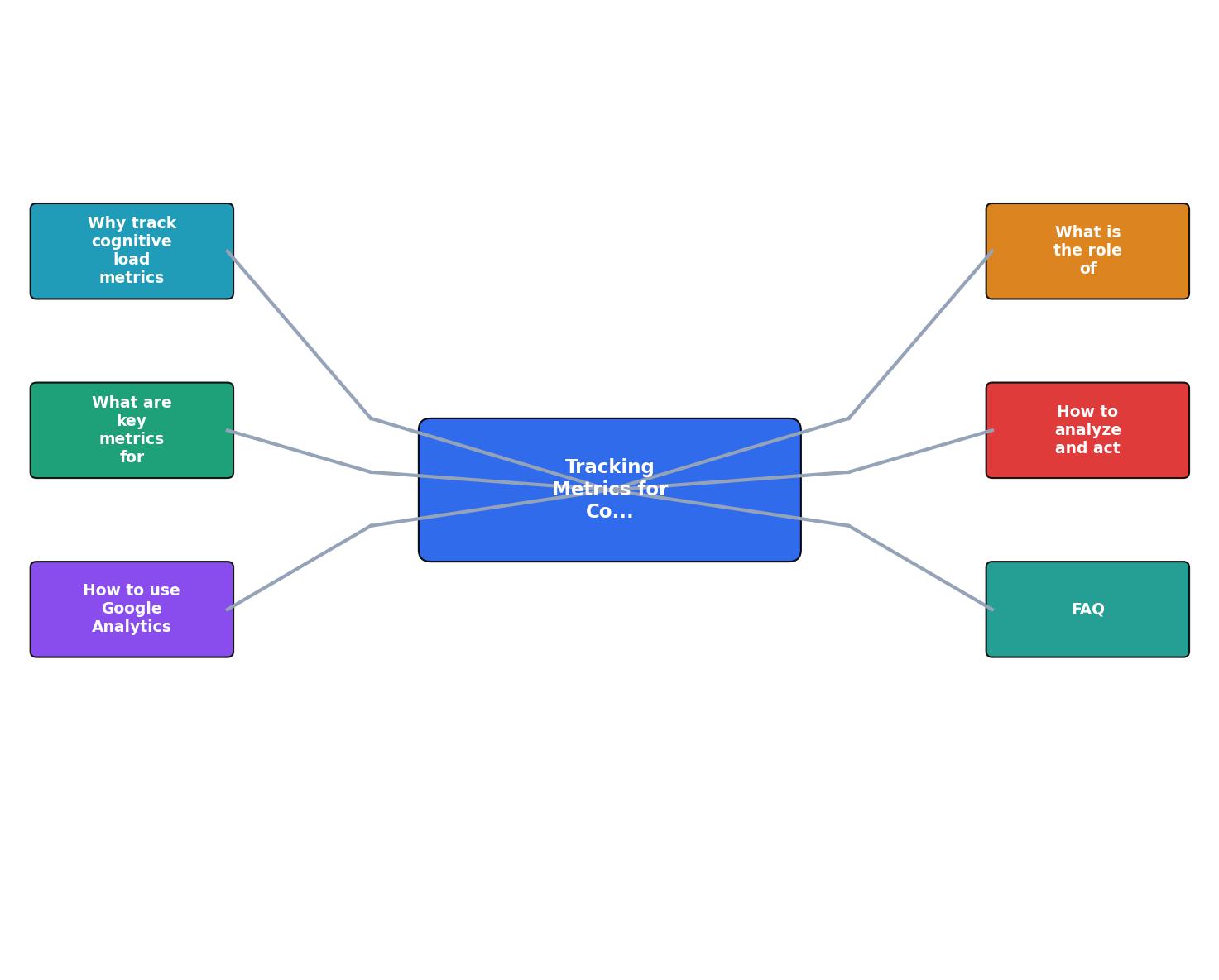
The process follows a clear loop: Define task > Instrument events > Collect baseline > Make change > Compare metrics > Iterate. Each step feeds the next, and skipping the baseline step makes everything after it unreliable.
Heatmaps reveal the "why"

Numbers tell you something changed. Heatmaps show you where and how. Tools like Hotjar, Microsoft Clarity (free), and FullStory generate click maps, scroll maps, and attention maps that visualize exactly how visitors interact with your page.
Here is what to look for:
- Rage clicks on non-clickable elements. Visitors expected a button or link and got frustrated. That is a cognitive mismatch between visual design and expected behavior.
- Dead zones where nobody clicks or scrolls. Content in these areas is either invisible or irrelevant to visitors.
- Clustering around the wrong elements. If visitors click your decorative image instead of the actual CTA button, the visual hierarchy is failing.
Microsoft Clarity is free and integrates directly with GA4, making it a solid starting point. For deeper analysis, tools like PagePerson Insights can surface cognitive accessibility issues that heatmaps alone miss, identifying specific elements that create comprehension barriers for different visitor segments.
Analyze and act on the data
Collecting data is the easy part. Acting on it correctly separates useful optimization from random changes. Follow these principles:
Compare cohorts, not snapshots
Never compare a single day's metrics before and after a change. Traffic fluctuates by day of week, traffic source, and seasonality. Compare at least two full weeks of data from each period, and segment by traffic source to avoid mixing organic and paid visitor behavior.
Prioritize by revenue impact
Not all pages deserve equal attention. Start with your highest-traffic, highest-intent pages: pricing, signup, checkout, and primary landing pages. A 5% improvement in task completion on a page that gets 10,000 monthly visitors matters more than a 20% improvement on a page with 200 visitors.
Run changes sequentially
Changing three things at once makes it impossible to attribute results. Change one element (headline, form layout, CTA placement), measure for two weeks, then move to the next change. This is slower but produces reliable data. For more structured testing, check out our guide on setting up A/B tests to evaluate cognitive accessibility changes.
Document everything
Keep a simple changelog: date, what changed, which page, and the metric you expect to move. After two weeks, record the actual result. This log becomes your playbook for future optimizations and is invaluable when analyzing A/B test results to enhance website comprehension.
Here is an example dashboard showing the metrics that matter most for a typical SaaS landing page optimization cycle:
Example: SaaS Signup Page Metrics
Cognitive Load Metrics Setup Checklist
Your progress is saved automatically in your browser.
FAQ
Frequently Asked Questions
Additional Resources
- Relationship Between Eye-Tracking Metrics and Cognitive ... - This paper investigates the relationship between certain eye-tracking metrics and cognitive load in a mixed reality learning environment to provide a basis for ...
- Survey of Metrics for Cognitive Load in Intelligence ... - Questionnaires – One of the most widely used metrics of cognitive load is the NASA-TLX, in which users answer seven questions about their ...
- Understanding cognitive load with Tobii eye tracking - Cognitive load is a measure of how much mental effort someone is using at a given time. Understanding it adds a new layer to eye tracking, or ...
Need Help with Accessibility?
Improve your site's accessibility and conversion rates with our AI-powered analysis.
Get Started